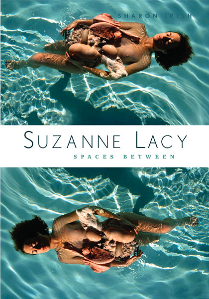
In September of 2009, the graphic designer at the University of Minnesota Press presented an idea for the cover of my book on Suzanne Lacy. Suzanne and I had both agreed that one image from her “Anatomy Lessons” series might be a good choice. The designer chose one that was a close-up of her in a pool, from the mid-70s, and then also flipped the image. I loved it, but Suzanne understandably had reservations. She objected to the manipulation of her work by placing it upside down as a double. She also (again rightly) felt that this one work was not representative of her entire oeuvre and that it was removed from the context of her lengthy visual consideration of violence against women. While I agreed with her on all counts, I also felt strongly that the cover worked powerfully and that its effectiveness made it worth the distortions. I am still not sure that I did the right thing pushing for this cover, but here is what I wrote several months ago, in support of the cover.
September 29, 2009
My relationship with Suzanne Lacy has been one of the most important of my life. (Did I say thank you?) One of the basic points of my book is that art exists in the relationships among people, who are anything but easy and straightforward. So this conversation is both “only about a cover” and about “everything” at once. Given the time crunch, the anxiety levels on all sides, and the importance of the issues, I think it helps to say that this is challenging work!
Here’s why I want to proceed with the current cover (beyond my own personal response of “I love it”):
This book is for an art audience. Using this work makes sense because it is beautiful and repulsive and not well known.Suzanne’s work is not merely pretty or gentle, and often edgy. This work is beautiful and repulsive, calm and alarming, and difficult, one reason why it is so powerful. Film historian Bruce Elder noted that Stan Brakhage [and Lacy in turn] set up a “tension between responding with horror at the images [in his film], and responding to the real beauty of the images (for they are astoundingly beautiful); that this is the character of the film’s central tension [and] suggests that beauty and horror lie close to one another, an idea that has long been a key to radical aspiration in the arts.” This is radical art. I don’t use “radical” lightly—by “radical art” I mean that art challenges glib assumptions and damaging values that have otherwise been normalized and are invisible.
By turning the image upside down, while it is not what Suzanne did, in a way brings out another aspect of the original: that floating can be like flying, disorienting, that bodies turn in water and air, that shadows in water alter forms. That bodies exist in space.
This is a work from early in Suzanne’s career—one of a series that is aesthetically very strong. On the cover, it provides a jumpstart to the beginning of the book. On the cover it supports the themes of the book: body, feminism, space.
I think this is an award-winning cover. If it won a design award, of course that wouldn’t hurt me or Suzanne that I can conceive of, but more importantly, I think it would be a small triumph for art of the seventies that was informed by feminism. Now of course it doesn’t represent all of that decade and certainly not all of Suzanne’s work. I don’t think there is one image that can do that, particularly because Suzanne has worked across scales, media and issues.
If feminism is a political position that analyzes power relations among people in order to foster social justice, how does this cover support that? I think it works more like a tactic than anything else. It is a beginning. People pick up the book to find out what that image is about, and look at the color plates in the middle. (Libraries will bind the book so the cover won’t show, so that eliminates some readers from this cover discussion.) They might even read some of the text!